5 Reasons Why Designers Use Grids in Website Layout

Any web designer strives to make a unique website every time he gets a new task on web design. There are many ways to make a website differ from other ones – one may use different colors, graphics, texts and layout techniques. But there is one feature common to designers all over the world – these are grids. In our today’s article we are going to tell you what makes grids so popular.
To begin with, web designers are not the only people who prefer grids. Look at your morning newspaper and you will see that grids are used for printed materials layouting either. People have always aimed at balance, proportion and harmony. And these can be achieved by using grid systems when it comes to website design too.
So, the reasons why designers like grids are as follows:
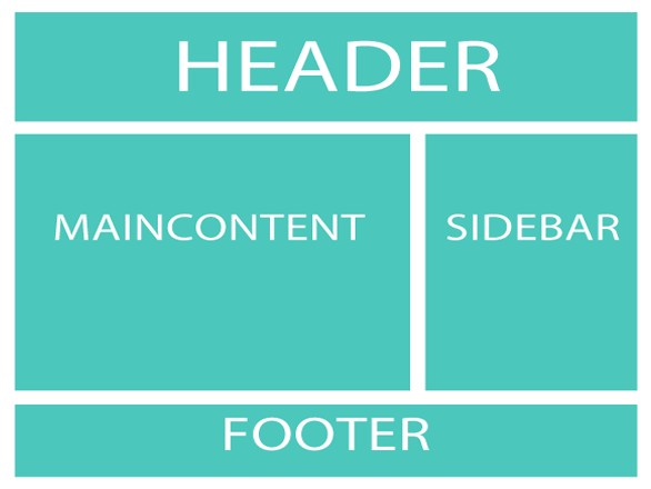
1. Grids can give designers a pre-conception of website layout.
A grid is like a scheme of a future website. When a designer is discussing a project with his client, he can use this scheme to “fill in the gaps” in website layout he has in mind. So, it’s a great way to plan a designer’s work before he even starts working.
2. Grids allow you to balance website layout.
Website layout must always be well balanced. No matter how many images, texts or negative space is there in your site, this will make it easier for the visitors to read the contents. If your website has a good structure, it will look better. Besides, both usability and readability will be improved. As a result, users will consider a well-designed site to be professional and trustworthy. And this is what both designers and their clients can benefit from.
3. Grids help maintain typographic integrity.
Typography is a vital element of any website design. Using type, you can show the readers the most important parts of the website. Grids can help you use the proper sizes of your type. Thus, the website itself will look more balanced with the right sizes of the text for your banners, headings, texts and others.
4. Grids show uniformity and consistency.
Since grids are spaced distributed uniformly, it is likely to make the website seem to be like that, too. A website that has a proper distribution of elements and uniform lines is quite pleasant to look at and it is also the first step to better reading and understanding. All in all, this can even help you increase traffic to your site.
5. Grids allow designers to observe the use of negative space.
Negative space is absolutely necessary for any website layout since it gives breathing space for all the design elements. Reading a site where all the elements are too close to each other is just a nightmare! Grids help designers to apply enough negative space to make the layout look much easier for the readers’ eyes.
So, a grid is a very valuable tool preferred by many web designers.
Now, have your say on the use of grids in design!