An Insight into Responsive Web Design
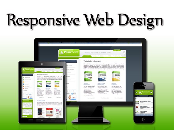
Mobile web has set up new standards for web designers and developers. The new generation of web design is Responsive Web Design. It is supposed to be compatible with desktop computers and notebooks as well as smart devices like iPods, iPads, i-phones, tablets, netbooks, etc. Since more and more users use their smartphones to access the Internet website owners want their websites to be available from such devices too, in order to increase both reach and range.
What is the essence of responsive web design?
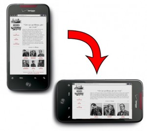
Responsive web design (the term coined by Ethan Marcotte) automatically identifies the platforms or environment through which the users access a website and responds to their actions. Screen resolutions, the width of the browser or orientation are taken into account it responsive web design.
It is impossible to design specifically for each smart gadget since every model has a different width and height for its screen. This is where responsive web design steps in – it will make your website fit any screen automatically!
The architecture of responsive web design is characterized by such features:
Flexible screen resolution
Everything is flexible in responsive web design. Using CSS you can crop both background and foreground images to make them fit the screen resolution of any gadget.

Fluid images
There exist some difficulties with high-quality images in web design. On the one hand, high-quality images have high resolution and bandwidth which makes the site load very slowly. That’s why in responsive web design the images should be proportionately re-sized. For the perfect rendering of high-quality pictures embedded in website design responsive web design uses fluid images that are scaled with height and width attributes.
Customized layout structure
The layout of your website should be customized and flexible enough to fit any browser, irrespective of the platform or the environment. To make a single layout will fit in all browser view ports a web designer must set an optimum width parameter.

Responsive containers
To make the layout frame in HTML flexible media queries are used. This enables a web designer to provide multiple layouts using a single HTML document. The style sheet specifies parameters like screen resolution, orientation, colors etc
Adapting for mobile use
Typically, to make a website look OK on a small screen, designers follow these strategies:
- Simplify page elements
- Hide non-essential elements
- Provide finger-friendly buttons and links
Click here to see how responsive web design works!


